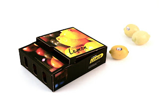
Package Design : the sourse Lemon
Came up with this design last year. This is the very first package design of mine ever. Through this design, I wanted to show lemon's refreshing colours. Normally we say it is lemon yellow when imagine about a lemon. Hoever, it got diverse colours. And may be I tried to add some Italian flavor onto it. Even thought I'd never been there. I used yellow and black because yellow outstands the most when it is surrounded with black.
It includes only three boxes but it was pretty awesome to do for me anyway. Before I began package design I only palyed with grid on 2 dementional space such as paper or computer screen. I should say it is kind of boring work as how I felt. On the contrary, the package design requires both 2D and 3D abilities.
P.S.
During and after this project I had to get rid off all the lemons I bought. So I decided to make real lomonade all at once. It was pretty awesome.


댓글
댓글 쓰기